ArakiTrade Documentation

ArakiTrade Documentation

The official reference for the ArakiTrade analytics dashboard. Use these docs to understand how the metrics are built, how the Basic and Advanced views fit together, and how to turn the historical behavior we surface into a repeatable daily workflow.

Documentation Home

ArakiTrade Documentation / Getting Started

Getting Started

Learn the basics of ArakiTrade and how to move from first login on the hosted dashboard to a repeatable daily workflow.

ArakiTrade shows how a stock has behaved in similar historical setups and what typically happened next over the following sessions. The backend handles the data and analytics. Your job is to open the dashboard, scan the metrics, and decide how they fit into your process.

We use end-of-day price and volume history to compute indicators and build higher-level summaries like Outlook, Seasonality, and Volatility. You never run this pipeline yourself, but knowing what the numbers are based on makes the dashboard easier to interpret.

If you are just exploring the tool, you can skim this Getting Started section and then jump directly into the Quick Start walkthrough for a concrete first session. As you become more comfortable with the interface, you can come back to the Core Concepts and Reference sections for deeper reference.

Getting Started / Onboarding & Tours

Onboarding & Tours

Use the first-login onboarding flow and in-app tours to learn the interface quickly.

On first login, ArakiTrade can show a short onboarding flow that confirms required policies and optionally guides you through the dashboard. The goal is to get you productive fast without requiring a long setup.

  • Walkthrough (Spotlight tour). The dashboard includes an interactive tour you can run at any time (for example from the top navigation). It highlights key areas like the Basic/Advanced toggle, filters, and symbol widgets.
  • Widget help buttons. Several widgets include a small help button that opens a quick, focused tour (notably Outlook, Calendar, Volatility, and Advanced view). Use these when you want the intent of the widget explained in place.

Use tours as a quick orientation to the interface. When you want definitions for specific fields or columns, jump to the Reference section.

Getting Started / Core Concepts

Core Concepts

Understand the fundamental concepts behind ArakiTrade and how the platform thinks about market behavior.

ArakiTrade focuses on answering a few practical questions for each symbol:

  • What typically happens next? For every stock, we look at historical paths to estimate how prices tended to move over a short lookahead window. This powers the Outlook views and forward-looking statistics.
  • How consistent is that pattern? Two stocks can have the same average outcome but very different reliability. Our Confidence metrics summarize how stable a pattern has been across different periods.
  • When does behavior change? Seasonality, earnings timing, and volatility regimes can all shift how a stock trades. ArakiTrade tracks these dimensions so you can see when a pattern is seasonal versus structural.

Same analytics, two layouts. When the Basic View is active, you are looking at the story of a single symbol through a collection of widgets (Snapshot, Outlook, Calendar, Volatility, News/About, and the Overview/Watchlist list). When the Advanced view is active, you are looking at the same analytics laid out as a sortable table across the whole universe. Filters, watchlists, and sectors help you move back and forth between these perspectives.

Built on daily history. All calculations are based on historical daily price and volume data and are meant to help you compare today to similar past setups. Use that as one input alongside your own risk rules and market context.

Getting Started / Quick Start

Quick Start

Follow this short walkthrough to get from zero to a simple daily workflow in a few minutes.

This Quick Start assumes that you have access to an ArakiTrade deployment and that the analytics have already been generated on the backend. There is nothing to install or configure locally; you simply open the dashboard in a supported browser.

  1. Open the dashboard. From your browser, navigate to the ArakiTrade dashboard. In the top bar you will see Filters, the Basic/Advanced toggle, Search, and the upper context (upper rail on desktop, widget shelf on mobile/tablet). You can leave everything in its default state for now.
  2. Pick a symbol to explore. Use the Basic list on the right or the search icon at the top to find a familiar ticker. Selecting a symbol updates the name, price, chart, and all of the widgets in the Basic view to that ticker.
  3. Read the symbol header and chart. At the top of the Basic view, the Symbol Header & Chart area shows the stock’s name, current price and change, the timestamp of the last update beneath the price, a Recently Viewed strip, and a large price chart with history buttons. Use this to orient yourself before diving into more specialized widgets. For more detail, see Symbol Header & Chart.
  4. Check the Outlook widget. The Outlook widget is a historical lookup: it finds past days that looked similar and summarizes what happened on the next trading day. Start with Cumulative (usually steadier), then check Targeted if it still has a solid Total Samples count. For a deeper explanation, see Outlook and Confidence.
  5. Review Calendar & Seasonality. Use the seasonality tools to see whether the upcoming session (and nearby dates) has tended to be stronger, weaker, or mixed for this symbol. Click a tile to see the counts, and check Observed before you trust the color. The calendar header provides a quick jump to today or the next trading day. See Calendar and Seasonality for more.
  6. Glance at Volatility, Snapshot, and News. Use the Volatility panel to understand how large today’s move is relative to recent history, the Snapshot widget for key stats (range, RSI, volume, earnings date), and News/About for quick context on catalysts. Together with the header and Outlook, these give you a fast read on the symbol’s current environment. See Volatility, News & About, and Snapshot Panel for more detail.
  7. Optional: Apply a simple filter. Open the filter panel from the Filters button. Start with a small number of numeric filters such as price, daily percent change, or short- and medium-term confidence to narrow the universe to symbols that currently look similar to your example. You can save useful combinations as presets. See the Filter Panel and Presets sections for ideas.
  8. Create a watchlist. From the candidates you like, add a handful of symbols to a watchlist using the star icon in the Basic view header, the Basic list, or the filter search results. This list becomes your focus set for the next few sessions so you can revisit ideas as new data arrives. See Watchlists for more.

As you repeat this workflow, you can layer on more advanced filters, incorporate additional metrics from the Reference section, and customize watchlists for different strategies or time horizons.

Getting Started / FAQ

FAQ

Common questions about how ArakiTrade works and how to interpret its outputs.

Do I need to install anything?

No. ArakiTrade runs as a hosted service. You access the dashboard through a supported browser, and the backend takes care of fetching data, computing analytics, and refreshing snapshots.

What data does ArakiTrade use?

ArakiTrade works with end-of-day price and volume data for each symbol in the universe maintained on the backend. That data is sourced and managed by the ArakiTrade analytics pipeline; you do not need to upload your own files or manage vendor feeds.

How often are analytics updated?

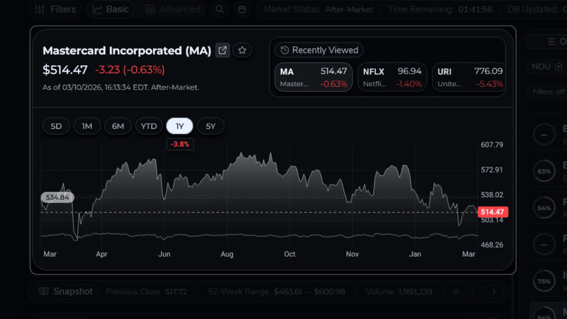
Analytics are refreshed automatically whenever new daily data is ingested on the backend. In a typical configuration this happens shortly after the market close. The General Market Data widget shows when the database was last updated, and the main symbol header in the Basic view shows when that stock’s snapshot was last refreshed directly beneath its price.

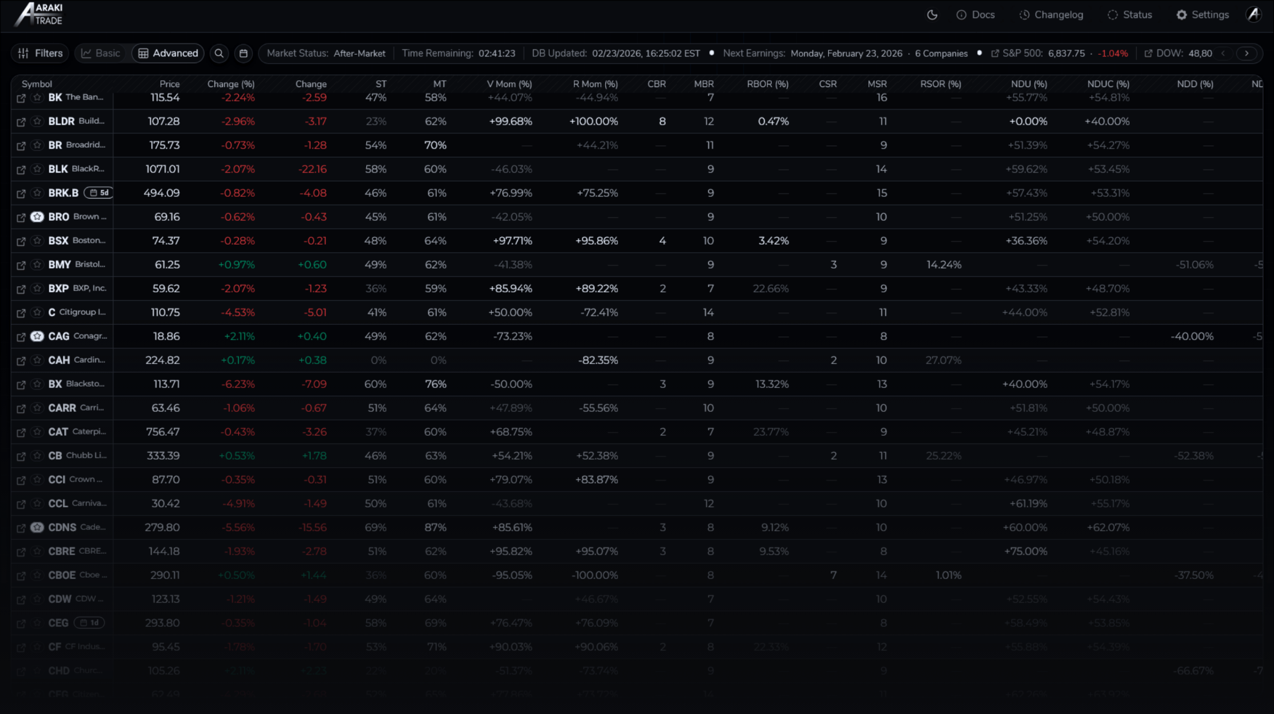
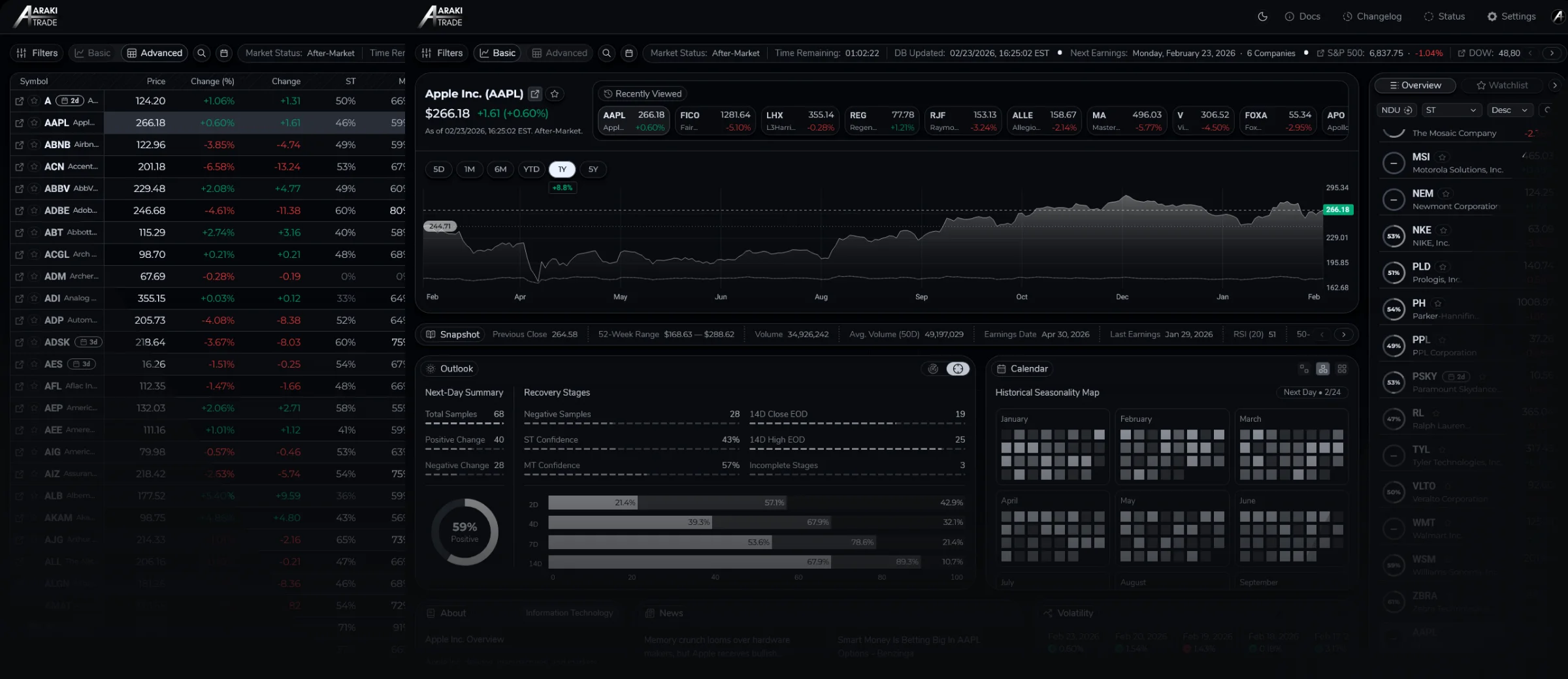
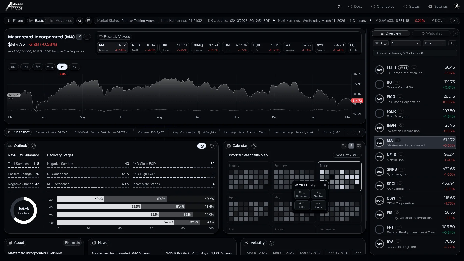
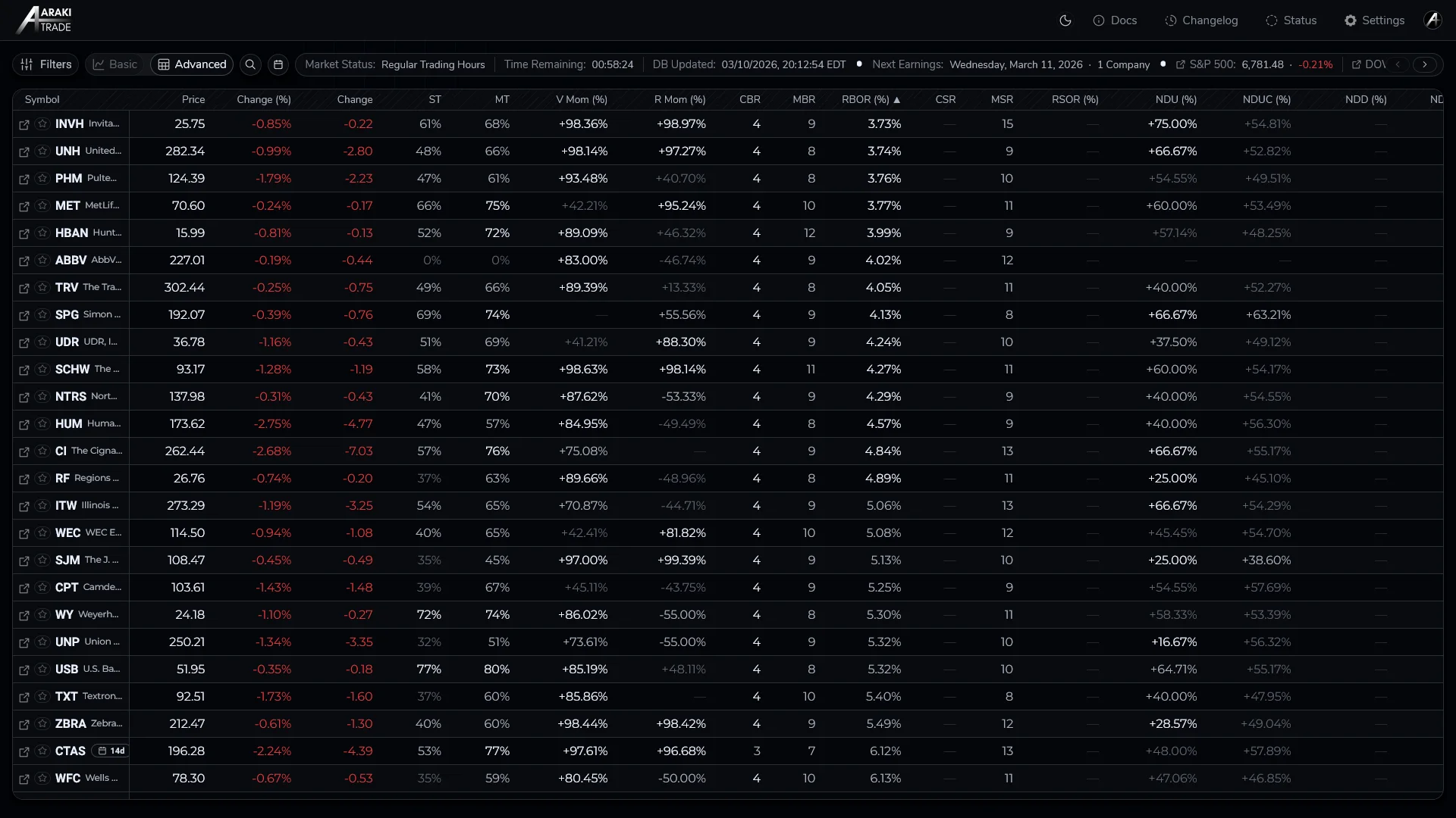
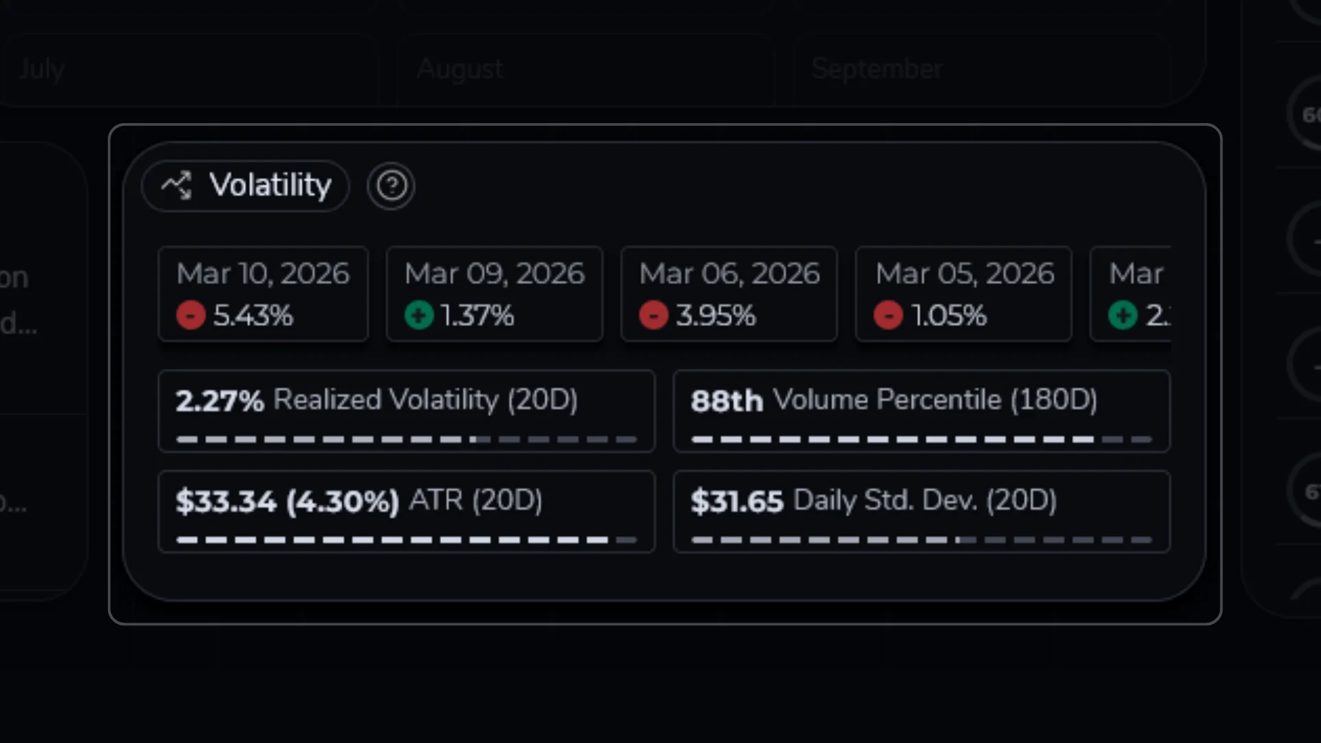
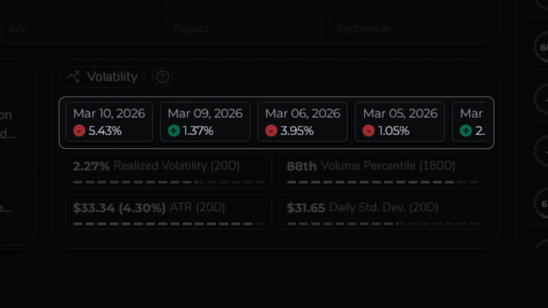
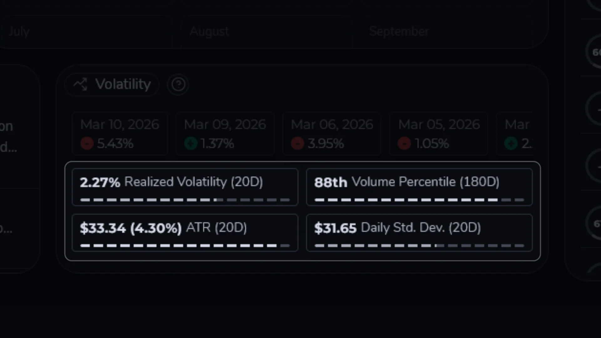
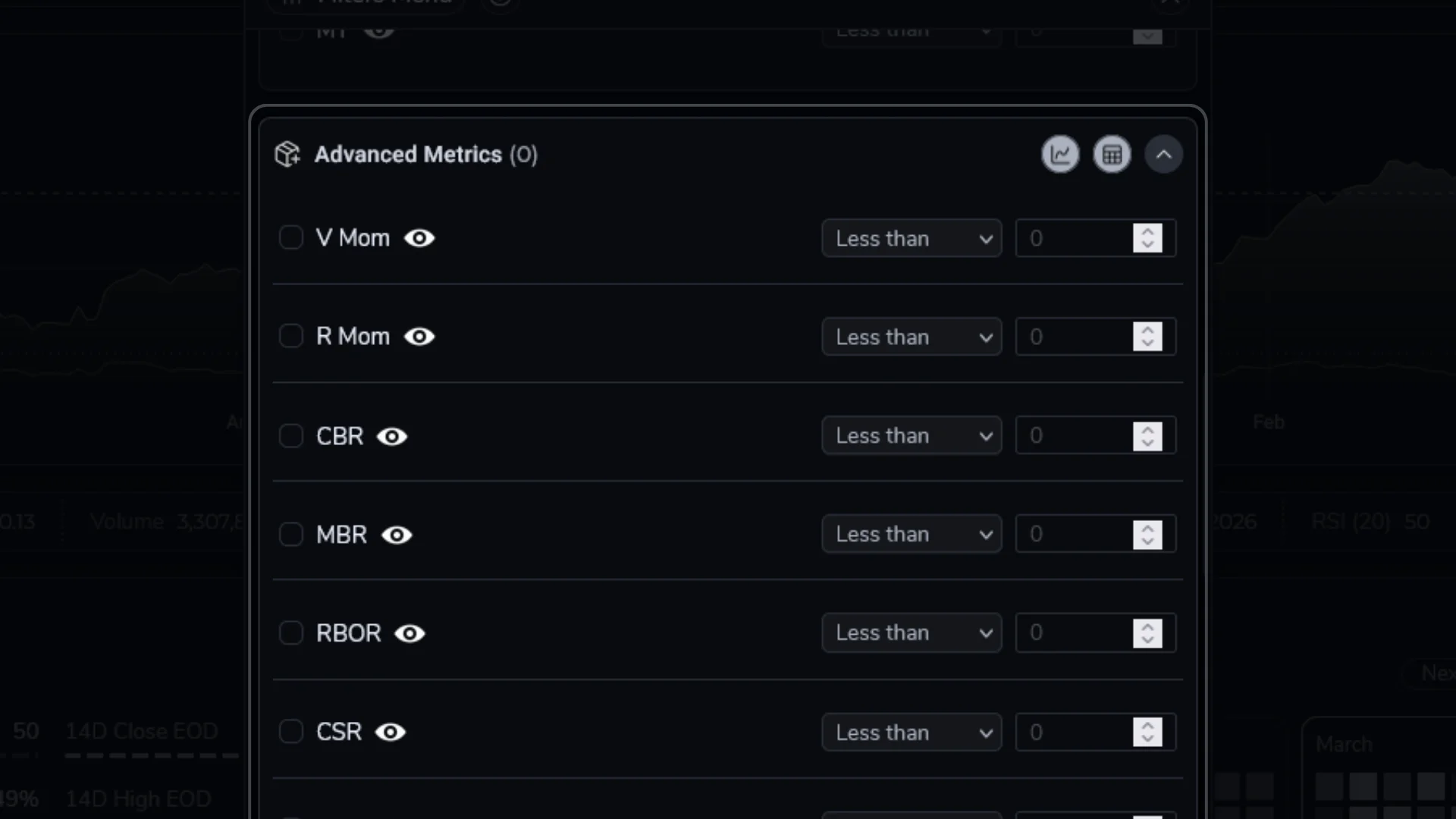
What is the difference between Basic and Advanced views?

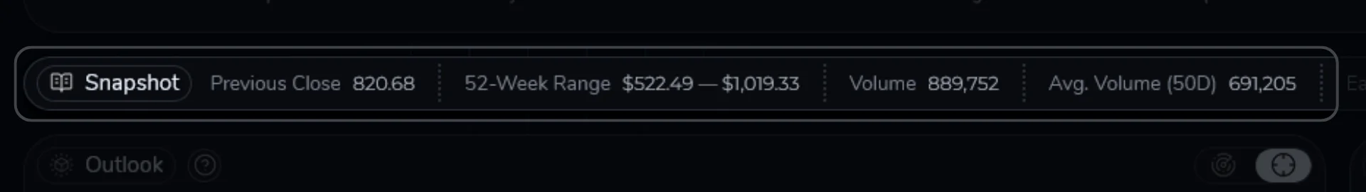
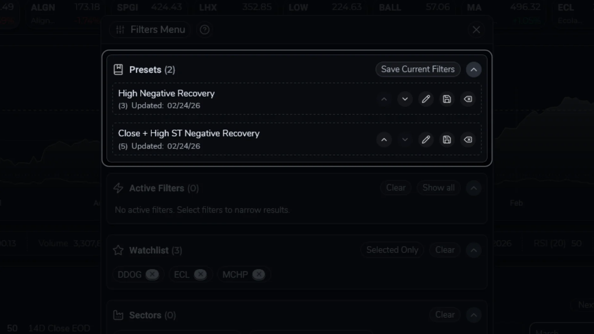
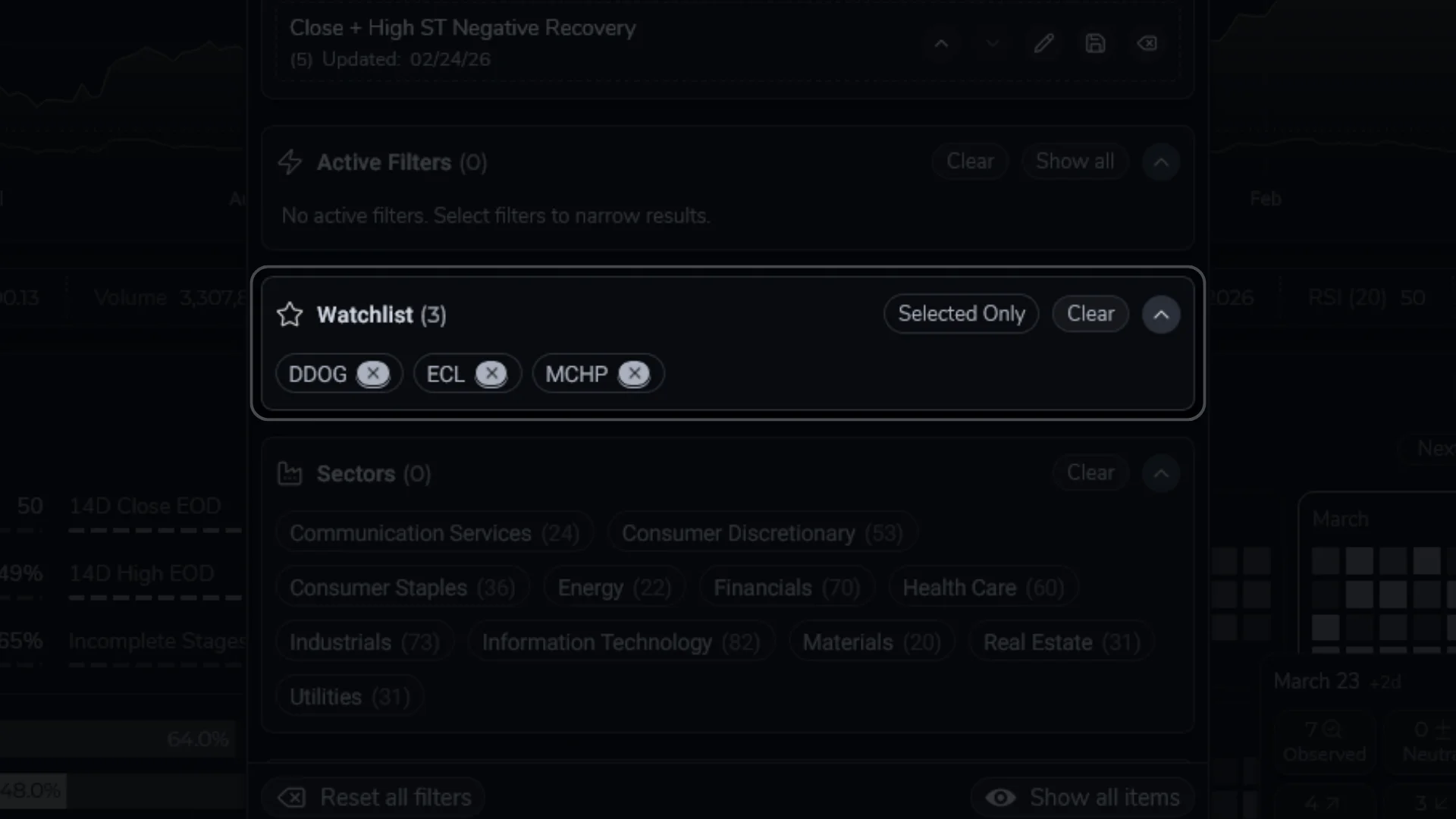
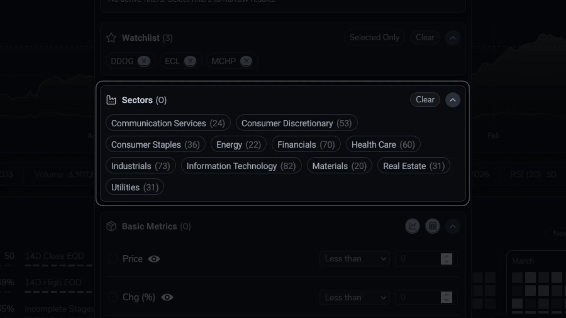
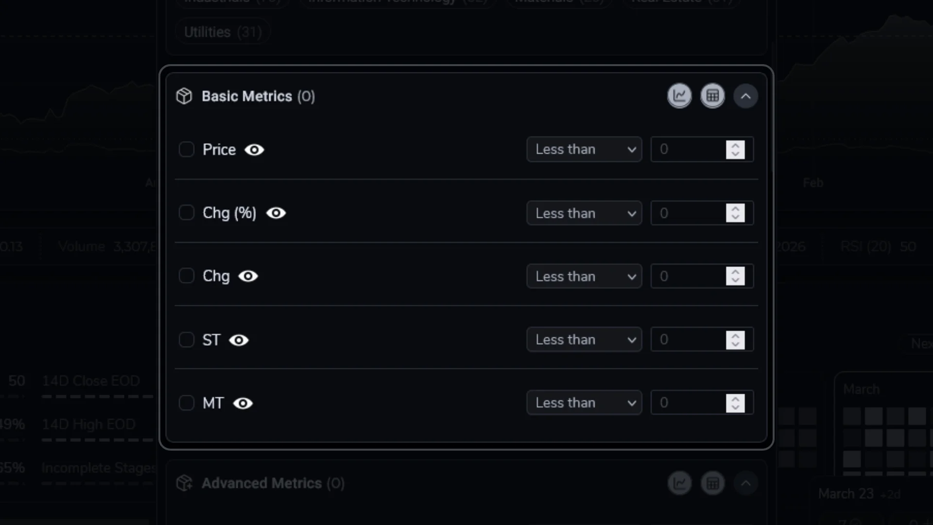
The Basic view focuses on one symbol at a time, with a price chart and a set of widgets (Snapshot, Outlook, Calendar, Volatility, News/About, and the Overview/Watchlist list). The Advanced view shows the same analytics as a sortable, filterable table across the entire universe. You can switch between them using the Basic/Advanced toggle in the dashboard header.

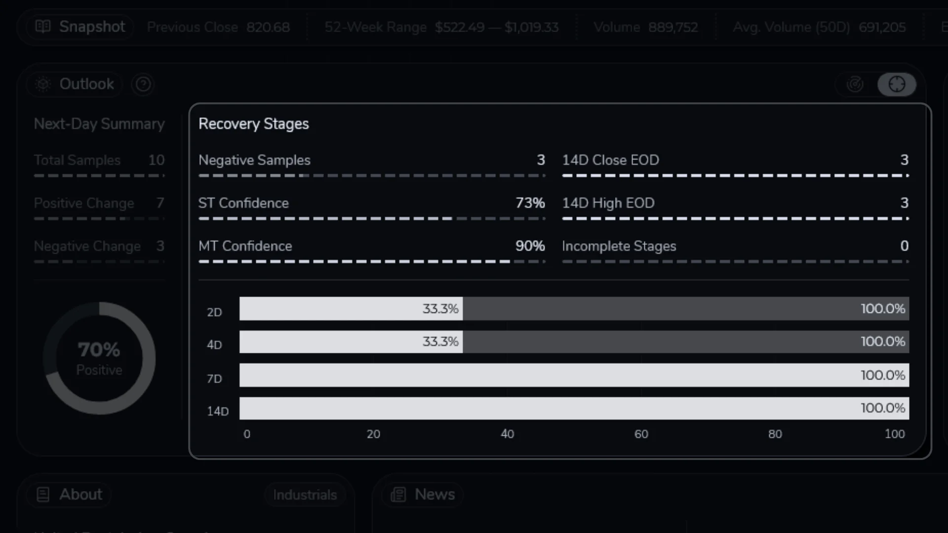
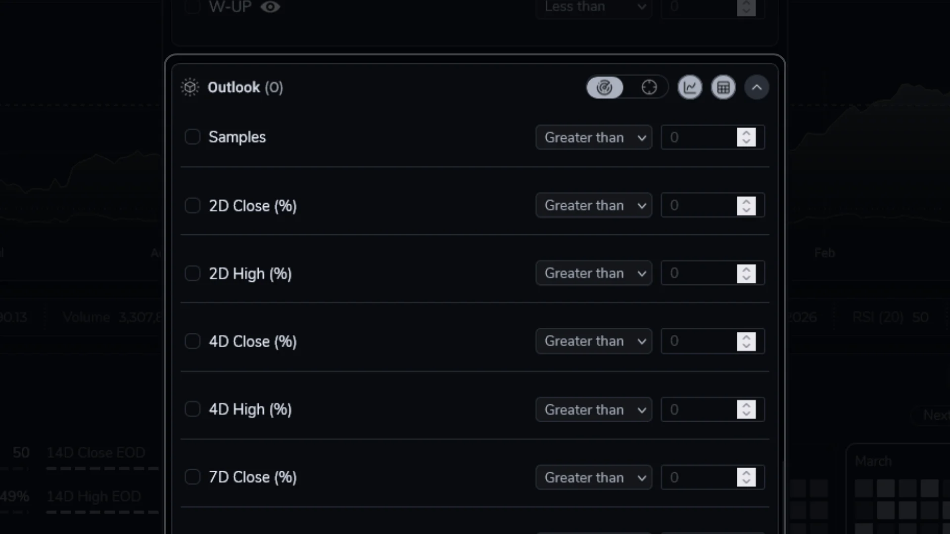
What does “Outlook” represent?

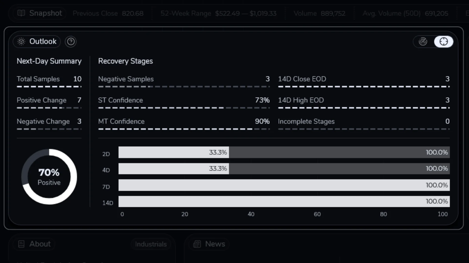
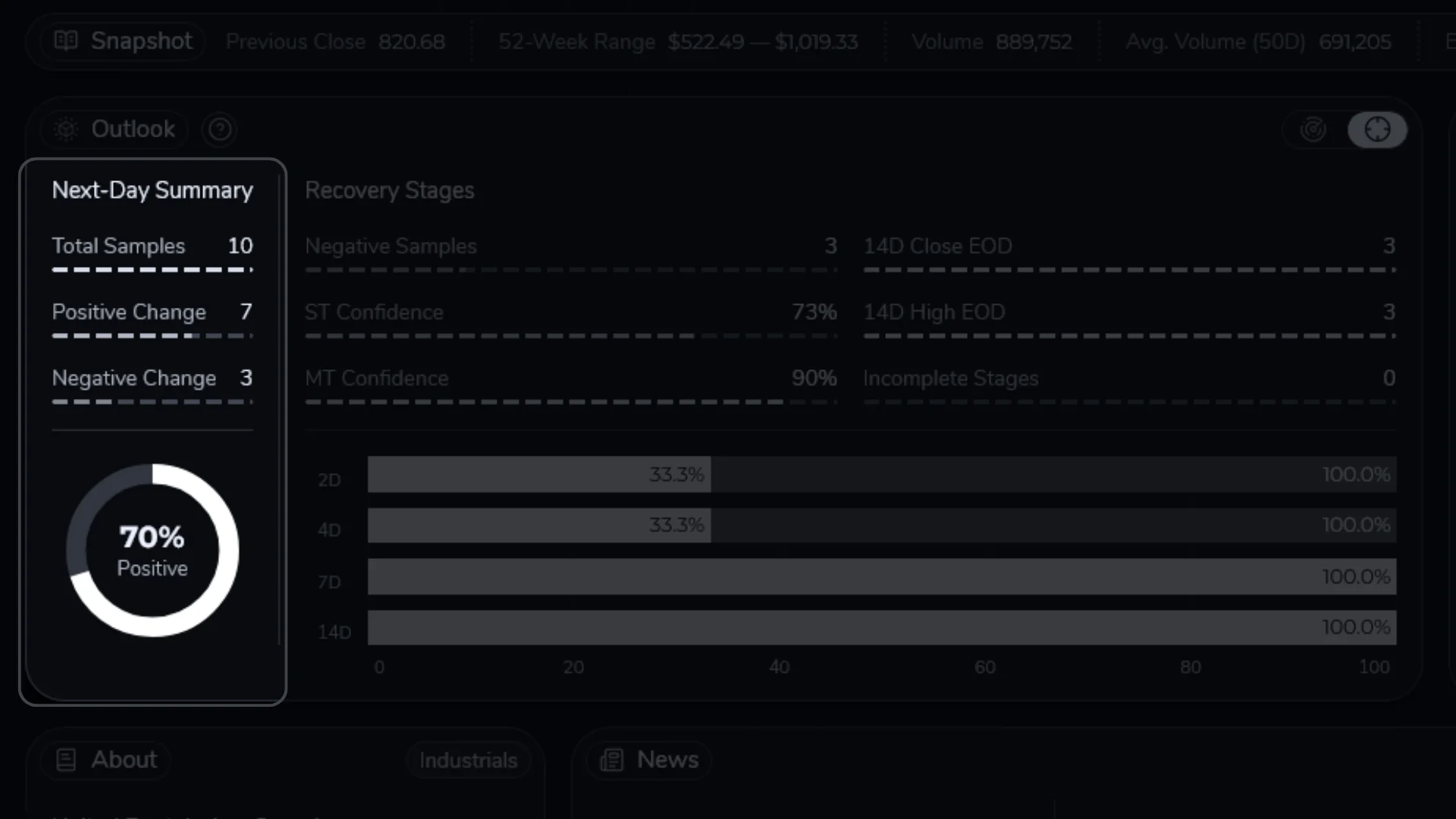
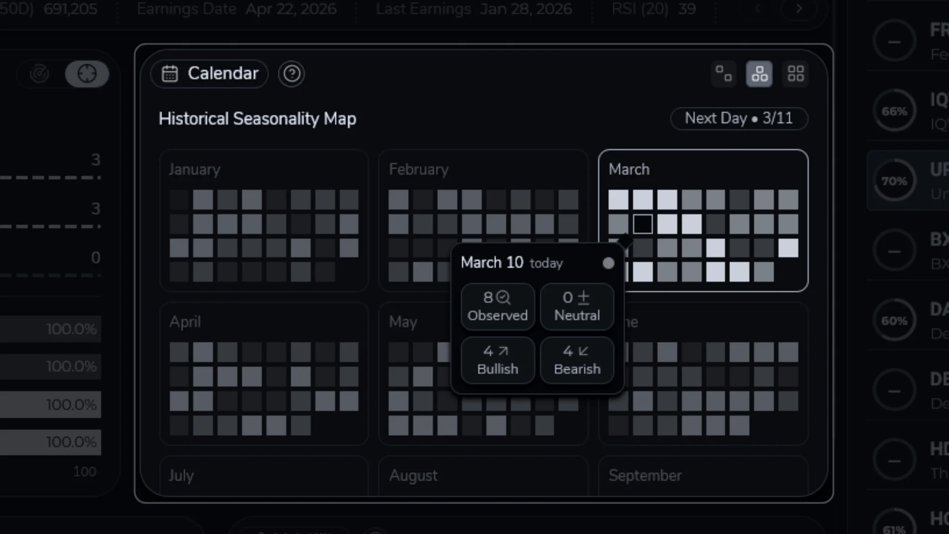
Outlook is a historical match-and-summarize view. It finds past days that looked similar to the current setup and shows what happened next (especially the next trading day).

What does “Confidence” represent?

Confidence is a quick read of how consistent the matched history has been. Higher confidence usually means the sample is healthier and the outcomes agree more often. Lower confidence means the outcomes varied more (and/or the sample is thinner).

What do “Targeted” and “Cumulative” modes mean?

Both modes start by finding similar-looking days in history. Here, “similar-looking” means a similar mix of recent price action and indicators (momentum, volatility, range position, and often volume/participation). It is not one single indicator.

Targeted adds one extra filter: it matches the current streak stage (how many up or down price closes in a row). Cumulative does not split by that detail, so it pools more history together and is usually steadier.

For the full explanation (including definitions, why this split exists, and how to interpret disagreements), see Outlook and Confidence.

Is ArakiTrade giving me trading advice?

No. ArakiTrade surfaces historical relationships and probabilities so that you can make more informed decisions. It does not provide personalized recommendations, and it does not take your risk tolerance, portfolio constraints, or objectives into account. You remain responsible for your own investment decisions.

Why do numbers change from day to day?

As new market data arrives, the underlying history and rolling calculations evolve. This can shift both the measured outcomes (for example, average forward returns) and the associated confidence levels. Expect metrics to drift over time as the data set grows and the set of “similar days” changes.

ArakiTrade Documentation / Dashboard Overview

Dashboard Overview

Explore how the Upper Widgets, Basic symbol view, Advanced table, and filter panel fit together on the ArakiTrade dashboard.

The ArakiTrade dashboard is your primary workspace. It brings together the universe of symbols, core analytics, and a symbol-focused Basic view into a single surface so you can scan the market, investigate individual names, and manage watchlists without switching between tools.

Docs Dual View
  • Top bar and navigation — access to the main dashboard, documentation, and any other pages that are part of your ArakiTrade deployment.
  • Upper context — on desktop, the upper rail summarizes session state (market status, time remaining, last database update, next earnings, and major indices). On mobile/tablet, a widget shelf provides deeper context and quick navigation.
  • Basic and Advanced workspace — the main area where you either view a symbol-focused Basic layout (chart plus widgets and lists) or the Advanced table of metrics across the entire universe. You can toggle between these with the Basic/Advanced switch.
  • Filter and selection tools — the Filters panel, watchlist controls, and sector tag toggles that determine which symbols appear in the Basic list and Advanced table.

Common flow: start wide in the Advanced table (filters + sorting), then switch to Basic for the few symbols you want to inspect (price action, Outlook, seasonality, volatility, and news).

Dashboard Overview / Layouts & Views

Layouts & Views

Learn how the Basic (widget-focused) and Advanced (table- focused) views relate to each other.

The dashboard layout is intentionally minimal so that the data stays front and center, but there are still two primary views to understand: Basic and Advanced. Both draw from the same analytics; they simply present them differently.

  • Basic view. A symbol-centered layout with the Chart, Snapshot, Outlook, Seasonality Calendar, Volatility, and News/About. Use this view to understand one name in detail. For a tour of these widgets, see Basic View.
  • Docs Basic View
  • Advanced view. A sortable, filterable table where each row is a symbol and each column is a key metric (price, daily change, confidence, momentum, streak-based stats, weekend/after-signal probabilities, and more). Use this view to scan the universe and build shortlists. See Advanced Table Metrics for a full description of each column.
  • Docs Advanced View
  • Shared filters and selections. The Filters panel, watchlists, and sectors apply to both views. When you change filters in the Advanced view, the available symbols in the Basic list update as well, and selecting a row in either place updates the Basic widgets to that symbol. Within the filter panel, the Basic/Advanced icons at the top of the Basic Metrics, Advanced Metrics, and Outlook sections let you choose whether those filters affect the Basic list, the Advanced table, both, or neither.

Dashboard Overview / Upper Widgets

Upper Widgets

Understand the upper context area (upper rail on desktop, widget shelf on mobile/tablet).

The dashboard has a compact context strip at the top so you can orient yourself before diving into symbols. On desktop, this is primarily the upper rail (session status, last update time, next earnings, and index moves). On mobile/tablet, you also get a fuller upper widget shelf that can show multiple context widgets.

  • General Market Data. Shows when the analytics database was last updated, whether the market is currently open or closed, and how much time remains in the session. Use this to confirm the data is fresh and whether today’s bar is still in motion.
  • Upcoming Earnings. Shows a scrollable list of upcoming earnings dates for the universe, with a popup view with search and more detail. Use it to spot names approaching event-driven windows that may change behavior or volatility. Clicking a symbol loads it into the current view.
  • Market Pulse. A quick snapshot of how the current universe is behaving (movers and counts). Use it as a lightweight scan to decide what to open next.
  • Index Overview. A compact view of major index performance so you can quickly gauge whether today is broadly risk-on or risk-off.

You can keep these visible as you work, or collapse the mobile/tablet widget shelf when you want more vertical space. If you click an earnings symbol while the Advanced view is active, the dashboard focuses it in the table; in Basic view, it loads the symbol into the Basic widgets.

ArakiTrade Documentation / Advanced View

Advanced View

Scan the universe in a sortable table and jump into Basic View when something stands out.

Advanced View is the table-focused layout of the dashboard. Each row is a symbol, and each column is a metric you can sort and scan. It is designed for quick shortlisting (find candidates fast) rather than deep per-symbol investigation.

  • Sort and scan. Click a column header to sort. Use this to surface outliers (big moves, unusual confidence, momentum shifts, or streak extremes).
  • Select a symbol. Clicking a row focuses that symbol so you can immediately inspect it in Basic View widgets.
  • Filters apply here too. The Filters panel, watchlists, and tags shape which symbols appear, whether you are in Advanced or Basic.

Advanced View / Advanced Table Metrics

Advanced Table Metrics

A reference for the main columns in the Advanced table and how to read them.

The Advanced table shows one row per symbol with the key numeric metrics laid out from left to right. The exact set of fields may evolve over time, but the current release exposes the following columns:

Docs Advanced View
  • Price. The latest closing price used in the current analytics snapshot.
  • Change (%). The current day’s close-to-close percent change. Useful for spotting outsized moves relative to the rest of the universe.
  • Change. The same move expressed in absolute currency terms instead of percent.
  • ST / MT. Short-term and medium-term confidence scores, scaled from 0 to 100. These summarize how reliably the underlying Outlook capsule patterns have played out over the next few days (ST) and over a longer multi-day window (MT). Higher values mean more stable historical behavior.
  • V Mom (%) / R Mom (%). Volume-based and RSI-based momentum measures. V Mom uses a volume/OBV style view of recent moves, while R Mom looks at momentum through the lens of RSI. Positive values generally indicate stronger recent upside behavior; negative values indicate downside pressure.
  • CBR / MBR. Current and maximum down-streak lengths. CBR shows the current length (in days) of the ongoing sequence of negative closes when it is at least two days long; MBR shows the longest such streak seen in the available history. Comparing CBR to MBR tells you whether today’s drawdown sequence is ordinary or approaching extremes.
  • RBOR (%). For a current down streak, an unconditional “remaining chance” metric: how often similar negative runs in the past have extended one more day. Higher values suggest that, in history, streaks like the current one have more often continued than stopped.
  • CSR / MSR. Current and maximum up-streak lengths on the upside, defined similarly to CBR/MBR but for positive close streaks. Extended up-streaks can provide context for how stretched a move has become relative to the symbol’s own history.
  • RSOR (%). The counterpart to RBOR for positive streaks: how often strong positive runs have historically continued one more day beyond the current length.
  • NDU (%) / NDD (%). Targeted next‑day up/down probabilities derived from the same capsule statistics that power the Outlook widget. These are conditioned on a narrow match: similar-looking days plus a similar recent up/down streak situation. On days when the current move is negative, NDU is emphasized; on positive days, NDD is more relevant.
  • NDUC (%) / NDDC (%). Cumulative next‑day up/down probabilities aggregated across a broader set of similar contexts without splitting by streak length. These values are usually based on more samples and tend to be smoother, making them useful as a stability check on the targeted NDU/NDD readings.
  • M‑S2B NDU (%) / M‑B2S NDD (%).  Specialized multi‑streak statistics that look at two‑leg patterns where a run in one direction is followed by a run in the opposite direction (for example, a multi‑day rally followed by a multi‑day pullback, or vice versa). These fields summarize how those specific two‑leg structures have tended to resolve around the current day. They are best treated as supporting context once you are comfortable working with the basic rally-length metrics (CBR/MBR and CSR/MSR).
  • W‑UP (%). Weekend Up percentage. On Fridays with a qualifying streak context, this shows how often the next trading day after a weekend (typically Monday or Tuesday after a long break) has closed higher in similar situations.

For day-to-day use, you do not need to use every column. Many workflows focus on a core subset (Price, Change, confidence, momentum, one or two rally metrics, and one of the NDU/NDD fields), then use the remaining streak and weekend metrics as extra context when a symbol looks interesting.

ArakiTrade Documentation / Basic View

Basic View

Understand the symbol-level widgets that appear when the Basic view is active.

When the Basic view is selected, the dashboard focuses on one symbol at a time. This documentation refers to that symbol-focused layout as the Basic View. Together, its widgets explain why a stock is behaving the way it is and what its recent history suggests about potential next steps.

Docs Basic View

When you select a symbol—from the Advanced table, from the Basic Overview list, or from search—the name, price, chart, and all of the widgets described below update to that ticker. This makes it easy to step through a watchlist or filtered set while keeping a consistent per-symbol view.

Basic View / Symbol Header & Chart

Symbol Header & Chart

See the name, quote, last update time, recently viewed list, and main price chart for any symbol.

The Symbol Header & Chart is the first widget you see in the Basic view. It anchors the rest of the dashboard by showing which symbol you are looking at, when its analytics were last refreshed, and how price has behaved over your chosen history window.

Docs Chart Widget
  • Header and controls. The stock name and ticker appear at the top, alongside a link icon and a star button. The link icon opens the symbol’s page on your configured reference site, and the star adds or removes the symbol from your watchlist.
  • Price, change, and timestamp. The current price and daily change are shown prominently, with a timestamp beneath them indicating when this symbol’s analytics snapshot was last updated.
  • Recently Viewed list. To the right of the header, a compact list shows symbols you have recently opened, including their last prices and daily changes. This lets you switch between a handful of names without re-running scans.
  • Main price chart. A history of the stock’s price, with simple lookback controls (e.g., 5D, 1M, 6M, YTD, 1Y, 5Y). Use this to get quick trend and context, not as a full charting package.
  • Range markers and badges. For any selected range, the chart draws a reference line and badge at the starting price on the left, and a contrasting line and badge at the current price on the right. The right-hand badge is color-coded to reflect whether the stock is up or down over that window, so you can see the move at a glance.
  • Hover details. When you move your cursor across the chart (or tap on touch devices), a small marker and tooltip follow the nearest date, showing the price and basic day-by-day details like open, high, low, close, and volume.

In most workflows, you will glance at the Symbol Header & Chart first to orient yourself, then move on to the snapshot, outlook, seasonality, volatility, and news widgets for a more detailed picture.

Basic View / Snapshot Panel

Snapshot Panel

Get a fast, factual snapshot of any stock with key statistics and recent structure.

The Snapshot widget sits under the main price chart in the Basic view and is your starting point for understanding a symbol’s core statistics. It focuses on where the current price sits in its broader context and how recent moves compare to typical behavior.

Docs Snapshot Widget
  • Location versus range. Statistics such as Previous Close, 52-week Range, and 50- and 200-day moving averages show where the current price sits relative to recent highs, lows, and typical trading ranges.
  • Momentum and participation. RSI, recent and average volume, and related readings give a quick sense of whether recent moves have been extended and whether they happened on heavier or lighter activity.
  • Earnings context. Upcoming and most recent earnings dates are shown so you can immediately see whether the current setup sits near a likely catalyst.

Use the Snapshot widget together with the Symbol Header & Chart to decide whether a symbol is worth a deeper dive. If the structure or regime is unclear, you can move on quickly; if it looks promising, the next step is to examine Outlook, confidence, seasonal behavior, volatility, and news. If terms like 52-week range, moving averages, or RSI are unfamiliar, see the Indicator Glossary for plain-language explanations and examples.

Basic View / Outlook and Confidence

Outlook and Confidence

Read the Outlook widget, its Targeted vs Cumulative modes, and the confidence metrics it exposes.

Outlook is a historical match-and-summarize widget. It looks for past days that resembled the current setup and then summarizes what happened next (especially the next trading day, and how quickly down days tended to recover).

Docs Outlook Widget
  • Next-Day Summary. Shows the total number of historical samples that match today’s context, how many of those closed up versus down, and a donut chart of the fraction that were positive. This is where you answer: “In the matched history, how often did the next day close up?”
  • Docs Outlook Next-Day Summary
  • Recovery Stages. Focuses on what has happened after negative days. It shows how many of those negative samples later recovered to new 14-day closing or intraday highs, how often recoveries remained incomplete, and two confidence scores summarizing how consistent these patterns have been over the short and medium term.
  • Docs Outlook Recovery Stages
  • Mode Toggle.  At the top of the widget controls whether you are looking at a very specific historical context (Targeted Mode) or a more aggregated one (Cumulative Mode).
  • Docs Outlook Mode Toggle

In both modes, “similar-looking days” means a match across the overall environment (recent price action plus indicators). It is trying to match the kind of day, not one single metric (momentum, volatility, range position, and often volume/participation).

What changes between modes is only one extra piece of context: Targeted additionally matches the recent up/down price streak stage (how many days in a row the move has been going). Cumulative does not split by that detail, so it pools more history together and is usually steadier.

  • Targeted mode. Uses the most specific context available: similar-looking days plus a similar recent up/down price streak situation. This is the “closest match” view, but it can be noisy when samples are limited.
  • Cumulative mode. Aggregates across a broader set of similar-looking days without splitting by price streak length. This trades some specificity for a larger, more stable sample size.
  • Short-term vs medium-term confidence. Short-term confidence reflects how consistently matched cases resolved over the next few sessions. Medium-term confidence reflects how consistent outcomes were over a longer window (for example, ~2 weeks).

Why have two modes? Because “stage of the streak” can matter. A day that starts a move can behave differently than a day that extends an already-stretched move. Targeted tries to capture that nuance; Cumulative protects you from overfitting when that nuance doesn’t have many samples.

  • Quick check: If Targeted and Cumulative disagree, you are either looking at a narrow slice of history (few samples) or streak stage genuinely matters for this setup. Let Total Samples and Confidence decide how much you trust Targeted.

How to use this in practice: read Cumulative first, then compare Targeted if the sample size is still healthy. When Targeted is thin, treat big swings as fragile. When it has a solid sample and higher confidence, differences versus Cumulative are more likely to be meaningful.

Use Outlook and Confidence as a fast read on how similar setups have played out historically. Treat small sample sizes cautiously and lean on Confidence when deciding how much weight to give a particular slice of history.

Basic View / Calendar and Seasonality

Calendar and Seasonality

Explore how calendar events and seasonality affect stock performance.

Many stocks exhibit patterns tied to the calendar: recurring behavior around earnings, holidays, or specific parts of the year. The Calendar widget surfaces these varying tendencies so you can see how a symbol usually behaves throughout the year.

Docs Seasonality Calendar

The Historical Seasonality Map shows the year broken into months, with each trading day represented as a small tile. Color and intensity indicate how often that date has closed up, down, or neutral across the available history, so you can quickly spot parts of the year that have tended to favor one direction.

Clicking on a tile opens a popover with counts for how many times that date has been observed, how often it finished bullish, bearish, or neutral, and a simple bias indicator. As with Outlook, sample size matters: a strong color with a small Observed count can swing easily.

Docs Seasonality Calendar Popover

At the top of the popover, the date header shows the currently selected day as well as the remaining time until this date. By default, the current (or next open) day is selected. You can use the keyboard arrows, click a different tile, or use the Next Day shortcut to jump quickly.

Use these tools to avoid treating all days as interchangeable when they are not. A setup that looks attractive in isolation may behave differently if it coincides with an earnings report, a historically weak seasonal window, or a date that has seen a wide range of outcomes in the past.

Basic View / Volatility

Volatility

Learn how the volatility timeline and volatility metrics add context to price moves.

The Volatility widget helps you understand whether recent price action is part of the stock’s normal rhythm or an unusually active regime. It is best used as a “relative-to-this-stock” view rather than a universal scale.

Docs Volatility Widget
  • Volatility timeline. Shows the most recent daily percent changes (up to a fixed number of sessions), with each day labeled by date, direction, and magnitude. This helps you see whether today’s move is large or small relative to the last few weeks.
  • Docs Volatility Timeline
  • Volatility metric strips. All are expressed relative to the stock’s own history rather than an absolute scale, so you can quickly see whether the current regime is quiet, typical, or elevated for this particular name. Think of them as “quiet / normal / active” for this stock.
  • Docs Volatility Metrics

Tip: use volatility alongside News & About to separate purely technical spikes from event-driven moves.

Combining volatility with context from News & About, Outlook, Confidence, and Seasonality gives you a more complete picture of why a stock looks the way it does today and how that compares to its typical behavior.

A common pattern is to treat these strips as a quick classification tool. For example, high volatility with high volume often points to event-driven trading, while high volatility with average volume can be more technical. Combining that view with Outlook and seasonality helps you decide whether today looks typical for the symbol or unusual.

Basic View / News & About

News & About

Use fundamentals context and headlines to understand what might be moving a symbol.

The Basic View includes two lightweight context widgets: About and News. They are not meant to be deep research tools; they exist to help you avoid misreading a move that is clearly catalyst-driven.

  • About. Shows a short description and basic metadata (like sector) for the selected symbol. Use it to sanity-check what the company does and whether the move fits the story.
  • News. Shows recent headlines for the selected symbol when available. Use it to spot obvious catalysts (earnings, guidance, M&A, regulatory, etc.) around the same time the volatility timeline spikes.

In practice: when you see an outsized day or a sudden regime shift in Volatility, scan this section next. If there is no headline alignment, treat the move as more technical and confirm with broader context (trend, momentum, and confidence).

ArakiTrade Documentation / Filters & Watchlists

Filters & Watchlists

Control which symbols you see and keep track of the ones that matter most to you.

Filters and watchlists work together to turn the full ArakiTrade universe into a focused workspace. Filters define the slice of the market you are currently studying, while watchlists capture specific sets of symbols you want to revisit across sessions.

Because the analytics are computed centrally and refreshed on your behalf, you do not have to manage any data feeds or calculations directly. Instead, you use filters and watchlists to decide how that precomputed information is presented in your dashboard, in both the Basic list and Advanced table.

Filters and Watchlists / Filter Panel

Filter Panel

Narrow the universe to symbols that match the behaviors you are currently interested in.

The filter panel (opened with the Filters button) lets you describe the kinds of setups you want to see. Rather than scrolling through every symbol, you can specify numeric conditions on key metrics and let ArakiTrade return only the names that fit, with the results reflected in both the Advanced table and the Basic list.

Docs Filters Menu
  • Search and results. A search bar at the top lets you quickly find symbols by name or ticker. Matches appear in the Search Results section, where you can jump straight to a symbol and add it to your watchlist without changing any filters.
  • Presets and Active Filters. Presets (documented below) store reusable combinations of conditions. The Active Filters section shows the chips for everything that is currently applied, along with quick actions to clear the set or show all columns again.
  • Watchlist and Sectors. Dedicated sections manage which symbols are in your watchlist and which S&P 500 sectors are currently selected. The Watchlist section includes a Selected Only toggle; the Sectors section uses chips and a Clear action.
  • Basic Metrics. Numeric filters for the main dashboard columns such as Price, daily percent change, daily absolute change, and the short- and medium-term confidence scores. Each metric row includes an eye icon you can toggle to hide or show that column in the Advanced table; the filter itself remains active even when the column is hidden.
  • Advanced Metrics. Additional filters for volume and RSI-based momentum, rally length stats, and streak-based probabilities (for example, the chance that a strong streak continues one more day, or how often certain signal contexts have led to up or down next-day moves). As with Basic Metrics, the eye icon lets you hide or show the corresponding column in the Advanced table without removing the underlying filter.
  • Outlook capsules. A specialized group that lets you filter on the same underlying capsule statistics used by the Outlook widget: minimum sample counts and minimum “OK” percentages for 2-, 4-, 7-, and 14-day close and high outcomes. The mode selector here mirrors the Targeted vs Cumulative behavior from the Outlook widget.

At the top right of the Basic Metrics, Advanced Metrics, and Outlook sections you will also see Basic/Advanced icons. These control whether that section’s filters apply to the Basic list, the Advanced table, both, or neither. This makes it possible, for example, to run a very tight scan in the Advanced table while keeping the Basic view more exploratory.

Start with a small number of simple filters so you can see how they interact. As you become more comfortable, you can layer conditions together to express more specific ideas while keeping the list of results manageable.

Filters and Watchlists / Presets

Presets

Save reusable filter combinations for common workflows.

Presets allow you to capture a set of filter conditions and recall them with a single action. This is useful for repeating the same scan day after day without having to remember every setting.

Docs Presets
  • Momentum longs. Symbols with positive outlook, higher confidence, and strong recent performance. For example, you might require daily percent change above a small positive threshold, both short- and medium-term confidence above a minimum level, and positive V Mom and R Mom so you are only scanning names that have been breaking higher on solid participation.
  • Mean reversion candidates. Names that have pulled back within longer-term uptrends but retain constructive outlooks. A typical preset might look for recent negative Change (%), a moderate CBR value (for example, a few days into a down streak rather than at the very start), and NDU or NDUC above a neutral threshold so you are focusing on pullbacks that have historically bounced.
  • Event-driven focus. Symbols with upcoming earnings or notable seasonal patterns paired with specific volatility characteristics. You might combine sectors, an upcoming earnings window identified from the Upcoming Earnings widget, elevated Weekend Up (%) or favorable NDU/NDD readings, and a minimum volume percentile so that only liquid, catalyst-heavy names appear.

You can create a preset from the current state of the panel using the “Save Current Filters” control, rename it, reorder it, overwrite it with new conditions, or delete it entirely. Over time, your presets become a library of scans aligned to your own style.

Filters and Watchlists / Watchlists

Watchlists

Maintain focused sets of symbols that you want to monitor closely.

Watchlists are persistent lists of tickers that you care about. While filters answer the question “what fits my criteria today?”, watchlists answer “which specific names am I actively following right now?” You can maintain multiple watchlists (for different themes or strategies) and switch the active list from the dashboard.

Docs Watchlist
  • Tracking symbols that emerged from a recent scan so you can see how they develop over the next few sessions.
  • Grouping names by theme, such as sectors, strategies, or time horizons.
  • Maintaining a short list of core holdings alongside a separate list of speculative ideas.

You can add symbols to your watchlist from several places: the star button in the Basic view header, the Basic Overview/Watchlist list, the Advanced table, and the filter panel’s search results. The Watchlist section in the filter panel shows all currently selected symbols and includes a Selected Only toggle you can use to restrict the universe to just that list.

Filters and Watchlists / Sectors

Sectors

Filter the universe by S&P 500 sectors.

In the current release, the Sectors section represents sector membership for the S&P 500 universe. Each chip corresponds to a sector (for example, Technology, Healthcare, Industrials), and you can select one or more to focus your scan.

Docs Sectors

You can clear the sector selection entirely to return to a sector-agnostic view while keeping your numeric filters and watchlists intact.

  • Sector chips. Click one or more chips to include those sectors in your scan.
  • Selection count. The header count shows how many sectors are currently selected.
  • Clear. Resets the sector selection back to none selected.

Filters and Watchlists / Basic Metrics Filters

Basic Metrics Filters

Apply numeric conditions to the main dashboard columns.

The Basic Metrics section contains the most common numeric filters used day-to-day (for example: price, daily change, and confidence columns). Each row lets you enable the filter, choose a comparison operator, and enter a threshold.

Docs Basic Metrics Filters
  • Enable checkbox. Turns that metric’s filter on or off.
  • Operator dropdown. Chooses how the value is compared (for example: greater than / less than).
  • Value input. Sets the numeric threshold used by the filter.
  • Visibility (eye) icon. Hides or shows the column in the Advanced table without removing the filter.
  • Basic/Advanced apply icons. Controls whether this section’s filters apply to the Basic list, the Advanced table, both, or neither.

Filters and Watchlists / Advanced Metrics Filters

Advanced Metrics Filters

Refine scans with deeper momentum, streak, and probability stats.

The Advanced Metrics section expands the filter set with additional analytics such as momentum and streak-based measures. Use these to tighten a scan after you’ve established a baseline with Basic Metrics.

Docs Advanced Metrics Filters
  • Enable checkbox + operator + value. Same control pattern as Basic Metrics: enable the row, pick the comparison, and enter a threshold.
  • Visibility (eye) icon. Hides or shows the corresponding Advanced table column while keeping the filter state intact.
  • Basic/Advanced apply icons. Lets you run a tighter scan in Advanced while keeping Basic more exploratory (or vice versa).

Filters and Watchlists / Outlook Filters

Outlook Filters

Filter on Outlook capsule thresholds and sample sizes.

The Outlook filter area mirrors the capsule-style thresholds used in the Outlook widget. You can require minimum sample sizes and minimum OK percentages across multiple horizons.

Docs Outlook Filters
  • Mode selector. Switches between the targeted vs cumulative capsule behavior.
  • Threshold inputs. Set minimum sample sizes and minimum OK percentages for the horizons shown.
  • Clear. Resets the Outlook thresholds back to their default (no thresholds applied).
  • Basic/Advanced apply icons. Controls whether the Outlook thresholds filter the Basic list, the Advanced table, or both.

ArakiTrade Documentation / Reference

Reference

Learn what ArakiTrade’s columns and indicators represent and how to interpret them in your own workflows.

The dashboard surfaces many derived metrics built from historical price and volume data. This section explains what those numbers mean and how to interpret them, without requiring you to follow every step of the calculations.

Where ArakiTrade uses familiar technical indicators (such as moving averages, RSI, or volatility bands), it applies them consistently and summarizes the signal rather than introducing new, proprietary concepts. Table columns, indicators, and Outlook measures combine these ingredients into probabilities and streak statistics you can scan quickly.

Reference / Indicator Glossary

Indicator Glossary

Short descriptions of the core technical indicators and stock terms used within ArakiTrade.

ArakiTrade relies on a small set of well-known technical indicators and plain-language concepts as building blocks. Below is a brief description of the most important ones, focused on interpretation and examples rather than exact formulas:

  • 52-week high, low, and range. The 52-week high is the highest price the stock has traded at over roughly the last year; the 52-week low is the lowest. The 52-week range shows where today’s price sits between those two anchors. For example, if the 52-week low is $80, the high is $120, and the current price is $100, the stock is halfway between its low and high.
  • Volume and average volume. Volume is how many shares traded during the current day; average volume is a typical daily amount over a lookback window. If average volume is 2M shares and today’s volume is already 4M shares halfway through the day, interest in the stock may be considered unusually high.
  • Moving averages and EMAs. Smooth price series over a chosen window to highlight the underlying trend and reduce day-to-day noise. Exponential moving averages (EMAs) weight recent prices more heavily, so they react faster. When price is above a longer-term moving average, the stock is generally in an uptrend; when it is below, the stock is generally in a downtrend. For example, a stock trading at $110 with a 50-day MA of $100 has been trending higher recently.
  • RSI (Relative Strength Index). A bounded oscillator that compares the magnitude of recent gains to losses to indicate when a stock has been extended to the upside or downside. Very high or very low readings suggest stretched conditions; changes in RSI while price is flat can signal momentum building beneath the surface. For example, an RSI of 75 with price near a 52-week high suggests a strong uptrend that may be extended.
  • Average True Range (ATR). A measure of typical daily range that incorporates gaps as well as intraday movement. In ArakiTrade, ATR is often expressed in both absolute terms and as a percentage of price to give a sense of how "big" a normal day is for a symbol. For instance, an ATR of $5 on a $50 stock (10%) is far more volatile than an ATR of $5 on a $500 stock (1%).
  • Realized volatility and standard deviation. Rolling measures of how widely daily returns have varied over a recent window. Higher values indicate a more turbulent regime; lower values indicate quieter trading.
  • Volatility bands and ranges. Bands around price derived from recent volatility (such as average true range or standard deviation) that help you see when price is stretching beyond its typical envelope.
  • Up-streaks and down-streaks. In the analytics table, these describe runs of consecutive up or down days (and related probabilities). A long down-streak means the stock has closed lower for many days in a row; a long up-streak means it has closed higher for many days in a row. These help you see whether the stock has been persistently trending or frequently reversing.
  • Earnings date and earnings window. The earnings date is the company’s scheduled quarterly report. The days just before and after earnings often have higher volatility and larger price gaps. In ArakiTrade, that date appears alongside other context so you can see at a glance whether a move is happening near a major catalyst.

These terms and indicators are not meant to be used in isolation. They work best when combined with ArakiTrade’s higher-level outlook, confidence, and seasonality metrics to form a coherent view of both recent behavior and typical patterns.